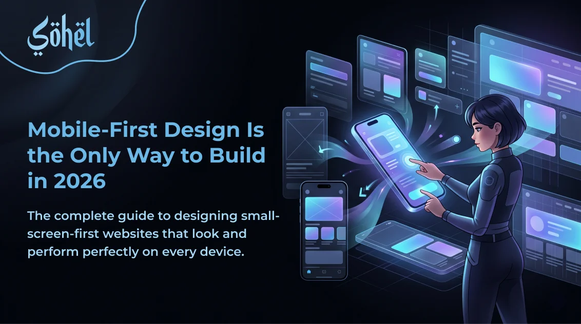
In 2026, over 70% of global web traffic comes from mobile devices. Google indexes the mobile version of your website first and uses it as the primary signal for your search rankings. If you are still designing websites at 1440px wide and then adding a few CSS breakpoints to "make it look okay on mobile," you are designing for 30% of your users first and serving 70% with an afterthought. Mobile-first design inverts this — and that constraint forces you to ruthlessly prioritise what actually matters.
This is also why the modern AI-ready website is built mobile-first from day one — AI search engines and voice interfaces serve primarily mobile users, making a mobile-optimised structure a fundamental prerequisite, not an afterthought.
Mobile-First Design Principles
Content Priority First
Mobile forces you to decide what's essential. If a section doesn't earn its place on 390px, it doesn't deserve desktop space either.
Touch-First Interactions
No hover states as primary UI. Tap targets minimum 44×44px. Design for fingers, not cursors.
Performance as Design
Mobile users are often on slower networks. Heavy images and scripts are design failures, not just technical ones.
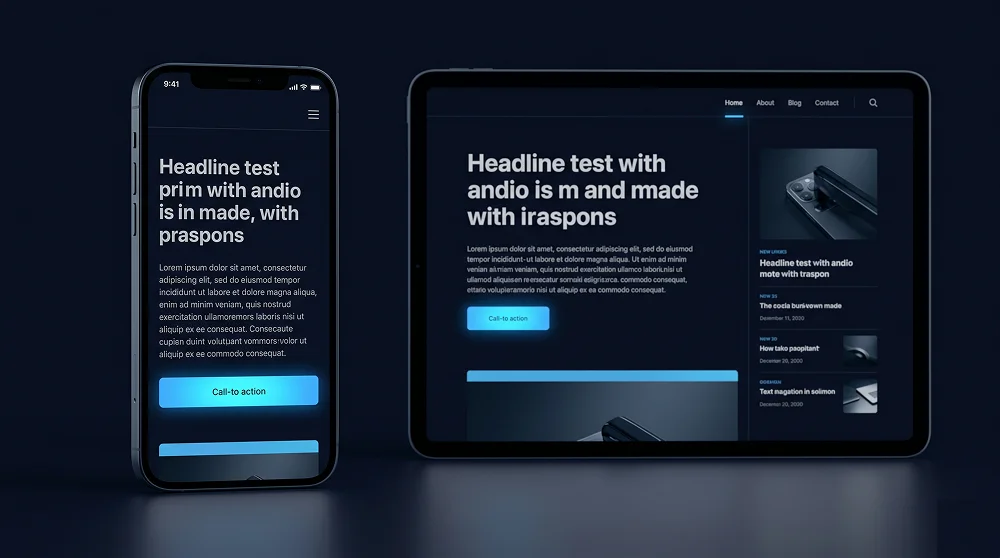
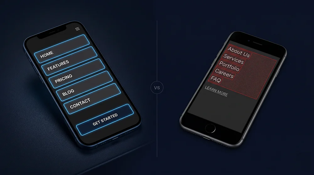
Single-Column Hierarchy
Mobile layouts are mostly single column. This forces a clear linear content hierarchy that guides users naturally through your message.
Touch Targets and Navigation
Apple's Human Interface Guidelines specify a minimum tap target of 44×44px. Below this size, tap accuracy drops significantly on moving real-world devices. Apply this to every interactive element: navigation links, buttons, inputs, checkboxes, and icon buttons.
| Element | Minimum Size | Recommended |
|---|---|---|
| Buttons (CTA) | 44×44px | Full-width on mobile, min 48px height |
| Navigation links | 44px height | 48–56px height in hamburger menu |
| Form inputs | 44px height | 48px height, 16px font-size (prevents iOS zoom) |
| Icon buttons | 44×44px | Use padding to extend touch area around small icons |
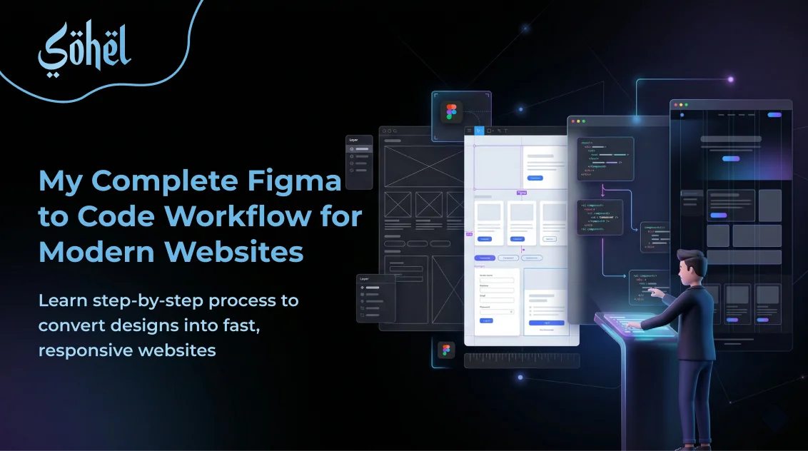
Mobile-First CSS with Tailwind v4
Tailwind CSS v4 is inherently mobile-first. Every utility class without a breakpoint prefix applies to all screen sizes including mobile. Breakpoint prefixes add styles for screens larger than that breakpoint. Write base styles for mobile first, then layer on desktop enhancements.
<!-- WRONG — desktop-first thinking -->
<div class="grid grid-cols-3 max-sm:grid-cols-1">

<!-- CORRECT — mobile-first Tailwind -->
<div class="grid grid-cols-1 sm:grid-cols-2 lg:grid-cols-3">

<!-- Typography — mobile base, scale up -->
<h1 class="text-3xl sm:text-4xl lg:text-6xl font-bold">

<!-- CTA — full-width mobile, auto on desktop -->
<a class="w-full sm:w-auto inline-flex items-center...">
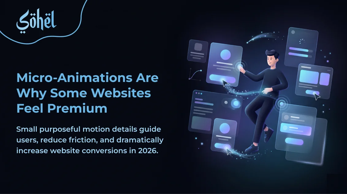
Mobile Micro-Animations
Touch interactions on mobile need purpose-built animations. Mobile micro-animations should respond to tap, swipe, and focus, and should be shorter than desktop animations (under 200ms) since touch feels more immediate. Our complete guide to UI micro-animations for high-converting websites includes a dedicated mobile section covering the exact timing, easing, and interaction types that work best on touch screens.
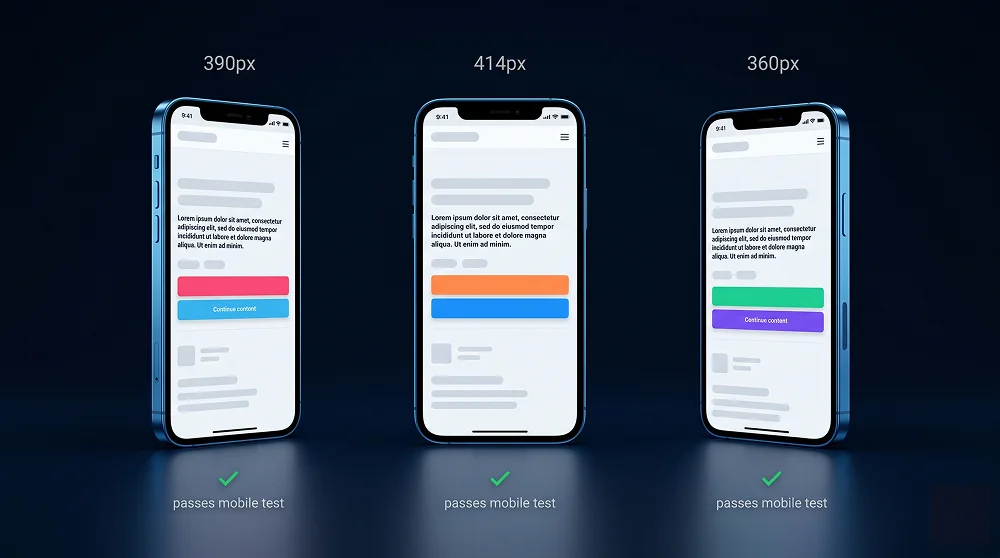
Testing Your Mobile Design
- Test on a real device, not just DevTools — Chrome DevTools emulation misses real-device rendering differences, touch feel, and actual hardware performance.
- Test at 390px (iPhone 14) and 360px (Android) — The two most common mobile viewport widths in 2026. Layout should look intentional at both.
- Check Google's Mobile-Friendly Test — search.google.com/test/mobile-friendly shows exactly what Googlebot sees when crawling your mobile version.
- Test forms end-to-end on mobile — Check that keyboard doesn't cover fields, iOS doesn't zoom on sub-16px inputs, and submit button is reachable.
Want a Website That Looks Perfect on Every Device?
Every website I build is designed mobile-first — tested on real devices, optimised for touch, and built to pass Google's Mobile-Friendly Test on the first try.
Get a Mobile-First Website
Professional Web Designer and WordPress Developer from Gujarat, India. Helping brands grow online through clean, fast, and conversion-focused websites.
View Profile